We may earn a commission from links on this page, at no extra cost to you. Picks are researched, not sponsored.
Correction versus grading
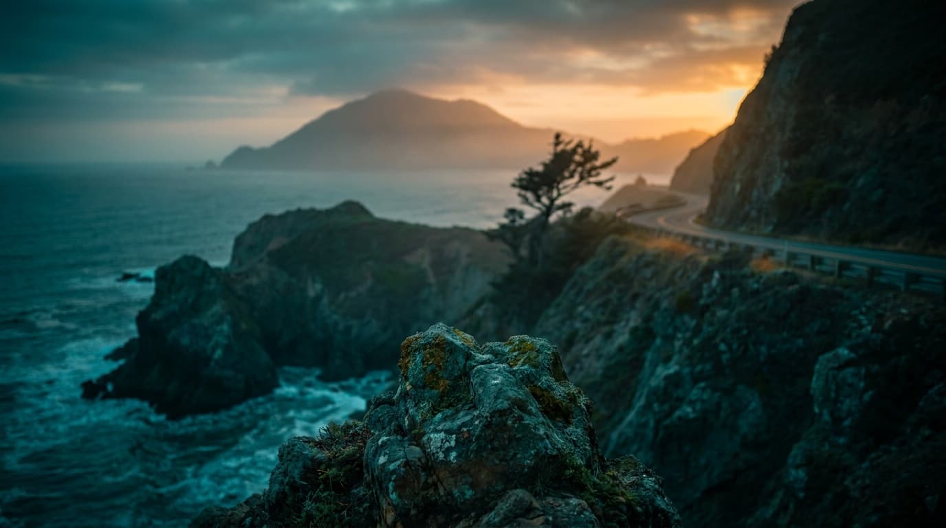
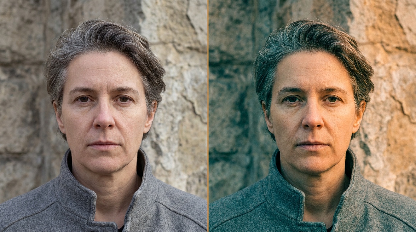
It helps to split editing into two stages. Correction is making the photo accurate: true white balance, right exposure, recovered highlights and shadows. Grading is what you do after that, on purpose, to give the image a feeling. A correction makes a photo look right; a grade makes it look like yours. For video profiles like D-Log M, F-Log2, and S-Log3, the companion is video codecs, formats, Log, and RAW explained.
This order is not optional. Grading on top of an uncorrected file means you are fighting a color cast and a bad exposure at the same time as trying to build a look, and the result is muddy. Correct first so you are styling a clean image, then grade.
The core grading tools
You do not need many tools to grade well. Three cover most of it.
The first is temperature and tint, the same controls you used for white balance, now nudged slightly off accurate on purpose. A touch warmer for a golden, inviting feel; a touch cooler for a calm or somber one. Small moves only.
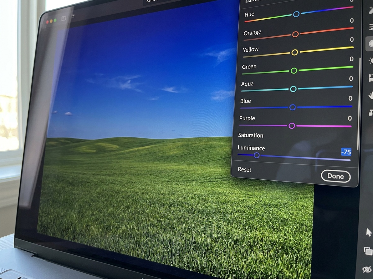
The second is HSL, for hue, saturation, and luminance, which lets you adjust one color at a time. This is where you bring down the orange in skin, deepen a blue sky without touching the rest, or mute a distracting green. It is the most useful grading panel for beginners because it is precise and easy to undo.
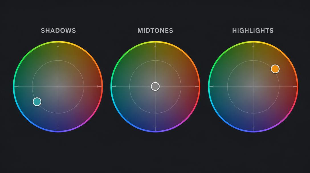
The third is color grading wheels (sometimes called split toning), which let you push a tint into the shadows, midtones, and highlights independently. Cool shadows with warm highlights is a classic cinematic combination. This is the most expressive tool and the easiest to overdo.
The two most common starting looks
Two grades cover most of what beginners want, and both are built from the tools above.
Teal and orange is the cinematic standard: cool the shadows toward teal, warm the highlights and midtones toward orange. It works because most scenes already split into warm subjects (skin, sand, golden light) and cool backgrounds (sky, shade, water), so the grade reinforces a separation that is already there. Keep it gentle and it reads as mood; push it hard and it reads as a phone filter.
Warm and faded is the lifestyle and film-emulation look: lift the blacks slightly so the darkest tone is a soft charcoal rather than true black, pull a little saturation out, and warm the whole frame. It feels nostalgic and soft. The risk is a flat, washed result if you lift the blacks too far, so use the histogram to keep some tonal range.
Common mistakes
The biggest mistake is grading too hard. Heavy teal-and-orange, crushed blacks, and a strong tint everywhere read as a filter, not a look. The good grades are quiet; you feel them before you see them. Make the move, then cut its strength roughly in half.
The second mistake is grading each photo differently, which defeats the entire point. The value of a grade is consistency across a set, so a gallery or feed feels like one body of work. Build the look once, save it as a preset, and apply it across the batch, adjusting only exposure per frame. The third mistake is grading before correcting, which leaves you styling a flawed file. Fix the basics first, every time. A fourth is forgetting that monitors differ; a grade tuned on a too-bright or too-cool screen will look wrong everywhere else, so grade on a steady, moderately bright display.
When grading matters
Grading earns its place when a body of work needs to feel unified: a travel gallery, a wedding set, a consistent social feed, or a portrait series that should share one mood. There, a repeatable grade is what turns a pile of good photos into a recognizable style.
For a single utilitarian shot, grading is optional and often unnecessary; correction alone is enough. As with everything downstream of capture, the cleaner your file going in, the more freedom you have, which is one more reason to get exposure right at the source through the exposure triangle and to check brightness against the histogram before you ever start styling.
What is the difference between color correcting and color grading?
Correcting makes a photo accurate: neutral white balance, proper exposure, balanced highlights and shadows. Grading is the creative step afterward, where you deliberately shape mood and a signature look. Correct first so you are grading a clean image, then grade for style.
How do I keep a consistent look across many photos?
Build your grade once, save it as a preset or profile, and apply it across the whole set, then adjust only exposure and white balance per frame for the lighting differences. This keeps the color identity uniform while letting each individual photo sit correctly.
Why does my color grade make people look unnatural?
Most likely the grade is pushing skin tones along with everything else. Use the HSL panel to bring skin hue and saturation back toward natural while the rest of the frame keeps your color. Also try cutting the overall grade strength, since heavy tints in the midtones tend to land hardest on faces.
What is the teal and orange look and why is it everywhere?
It cools the shadows toward teal and warms the highlights toward orange. It is popular because most scenes naturally split into warm subjects and cool backgrounds, so the grade strengthens a contrast that already exists. Keep it subtle; pushed hard it stops looking cinematic and starts looking like a filter.
Keep going
Next useful steps
Pick one. Each link continues the same job without starting the research over.
Shoot kits
Buy around the job, not the spec sheet
Creator kit
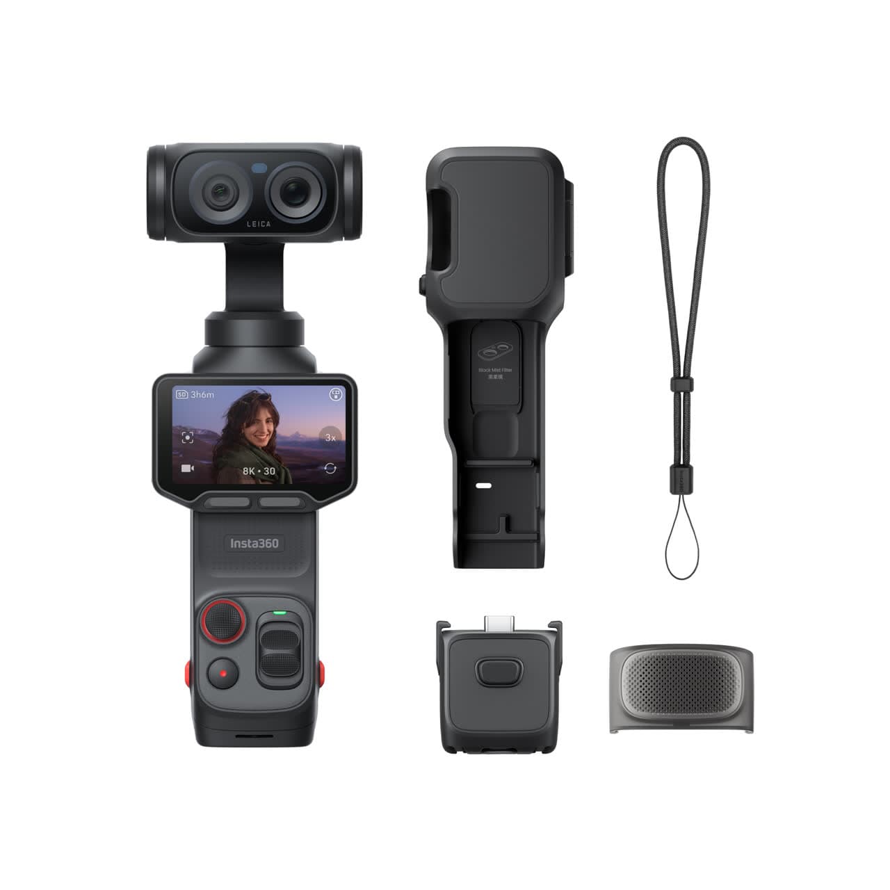
Solo vlogging kit
$1,286
A stabilized pocket camera, clean wireless audio, fast media, a backup drive, and a small light for one-person video.
Best low-friction creator kit
Buy order: start with the first piece that makes the job possible, then add the support pieces that remove friction.
Camera: start here. If this piece does not make the shoot easier, the rest of the kit can wait.
Light: add it after the core setup proves useful.
Insta360 Luna Ultra
Wide and tele framing, mechanical stabilization, and a detachable screen without a full camera rig.
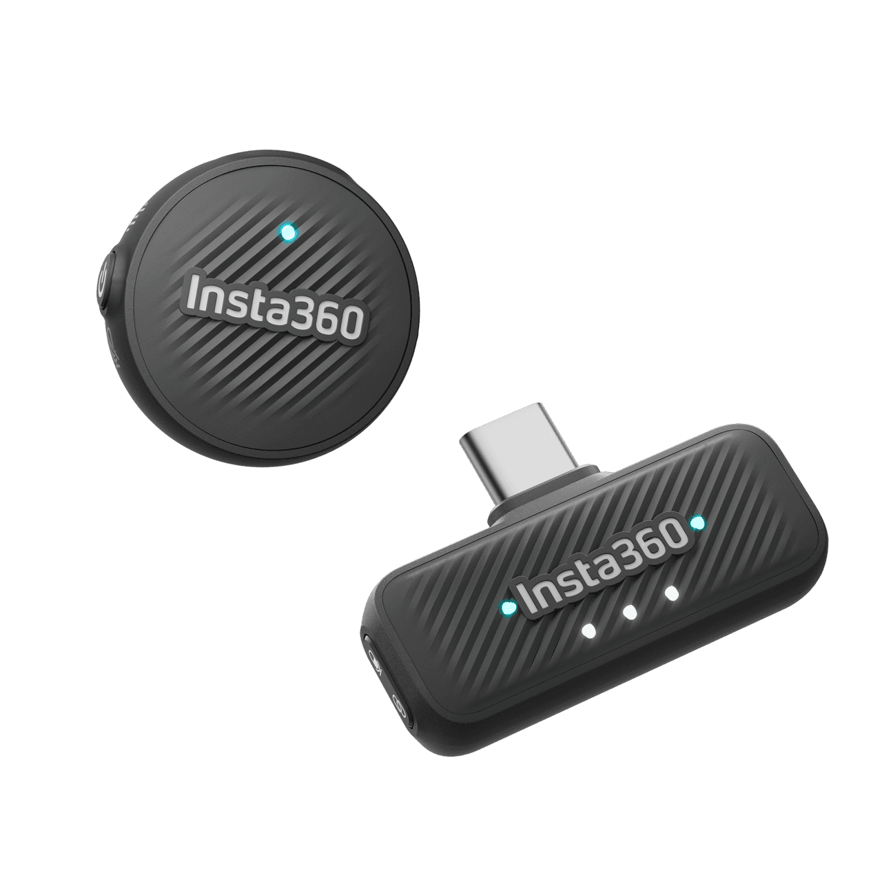
Insta360 Mic Air
Pairs directly with Luna Ultra for clearer speech without hanging a receiver from the camera.
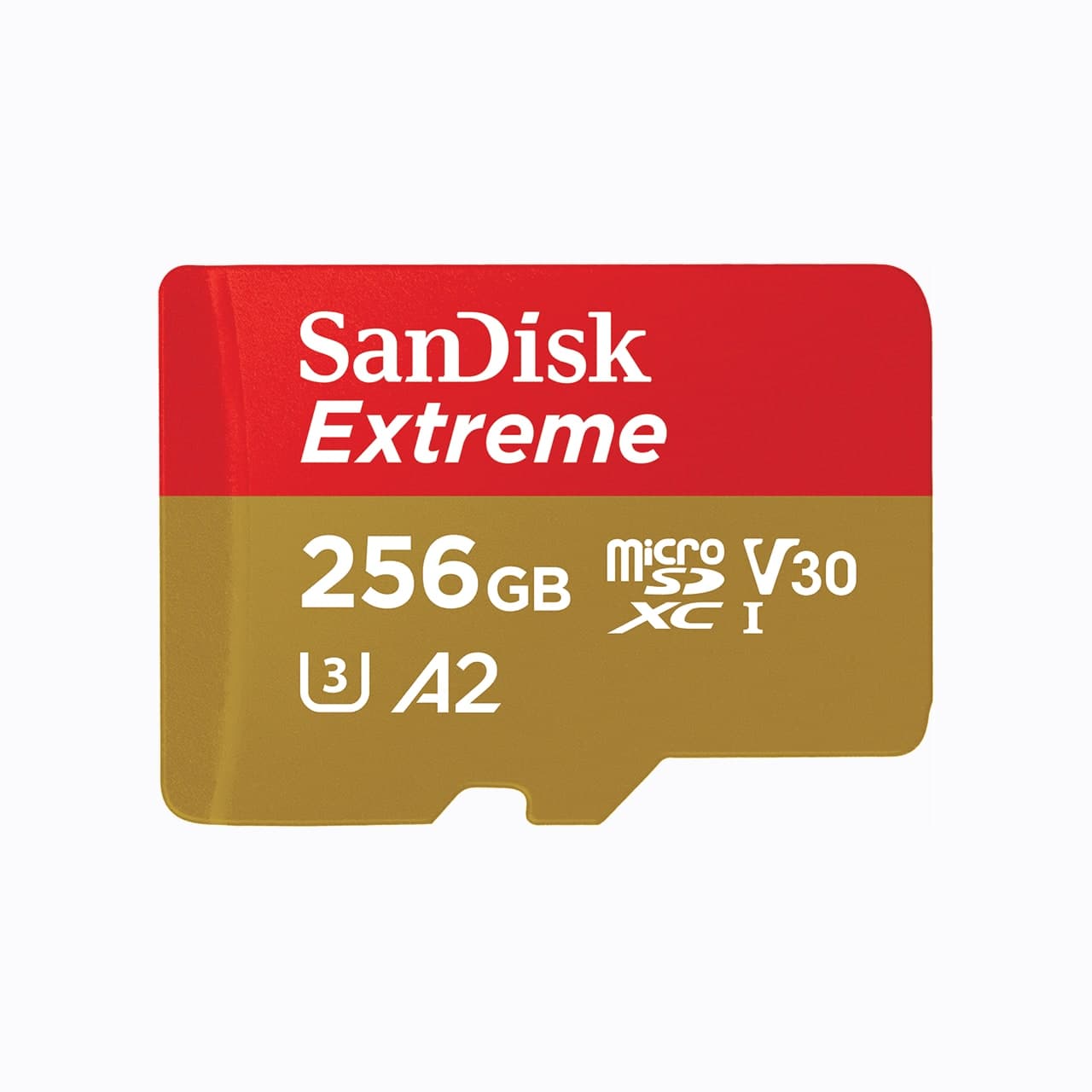
SanDisk Extreme microSDXC 256GB
Pocket gimbals and action cameras use microSD, not a full-size SD card.
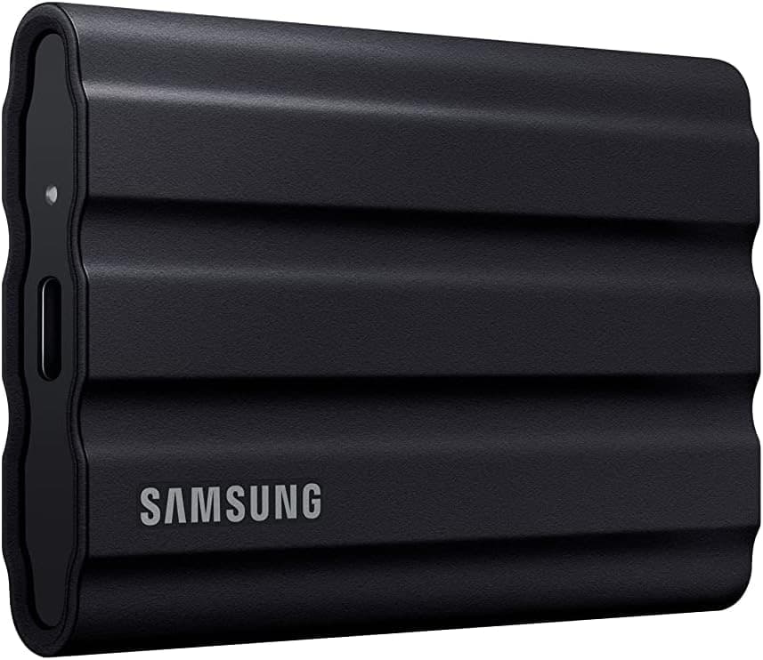
Samsung T7 Shield
A rugged pocket SSD for offloading footage before a card gets reused.
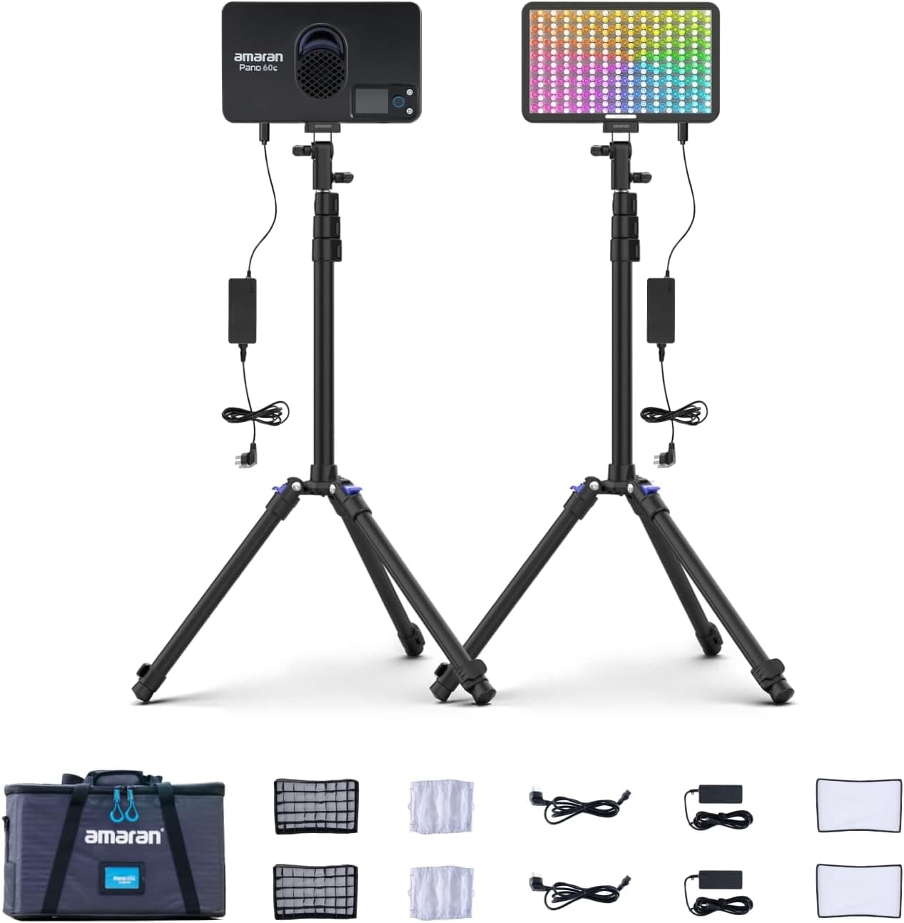
Amaran P60c RGBWW Panel
Soft, controllable fill for talking-head clips, product details, and ugly rooms.
Prices are rough catalog totals. Retailer prices change, and you can swap pieces to fit your system.
Related Learn guides

Content Credentials and C2PA Explained for Photographers
Content Credentials record a photo's signed provenance and edits. Learn what C2PA proves, what it cannot prove, and how capture-to-export workflows work.
Open Gate Video Explained: When 3:2 Is Worth It
Open Gate records a taller sensor area for flexible 16:9, 9:16, and square crops. See when it helps, what it costs, and how to frame it correctly.
Pre-Capture Photography Explained: Get the Frame Before the Click
Pre-Capture buffers photos before the shutter is fully pressed. Learn how it works, which settings change, and when RAW, flash, or focus may be limited.
RAW vs JPEG: Which File Format Should You Shoot?
RAW keeps all your sensor data for maximum editing freedom; JPEG is smaller and ready to share. Here is how they differ and when each one is the right call.
Researched, not personally tested: picks compare specifications, available owner feedback, and established expert sources. As an Amazon Associate I earn from qualifying purchases. We may earn a commission from links here, at no extra cost to you. How we research →