We may earn a commission from links on this page, at no extra cost to you.
What it is
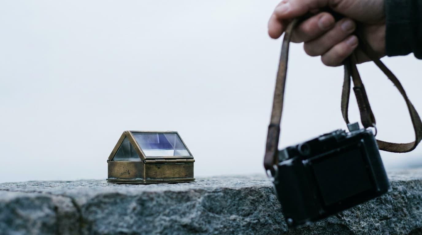
Every photo has a subject and everything else. Negative space is the everything-else when it is kept simple: an open sky, a blank wall, a still expanse of water, a plain background. The subject itself is the positive space. When the empty area is generous and uncluttered, the eye has nowhere to wander, so it locks onto the subject.
Negative space is how minimalist photos work. A single bird against a wide grey sky, a lone figure on an empty beach: the emptiness is doing the work, making the small subject feel significant precisely because it is surrounded by nothing.
How to use it
Decide how much room to give the subject and on which side. A common, reliable choice is to leave the open space in the direction the subject faces or moves, so it has somewhere to look or go. Pair this with the rule of thirds: place the subject on a third and let the negative space fill the rest.
Keep the empty area genuinely empty. A clean sky, a smooth wall, soft out-of-focus tones. Anything with detail or contrast in that zone competes with the subject and breaks the effect. A wide aperture that blurs the background into a smooth wash is one way to manufacture negative space when the scene itself is busy.
When to break it
Negative space trades information for impact. Sometimes you want the information: a rich street photography scene packed with detail, a landscape where every layer adds context, an environmental portrait where the surroundings tell the story. Fill the frame when the context is the point. Reach for negative space when the subject is the entire story and everything else is noise.
Common mistakes
- Empty space that is not actually empty. A "blank" sky with a stray cloud or a power line competing for attention is not negative space, it is clutter. Keep the empty zone clean.
- Space on the wrong side. Leaving the open area behind the subject, so it faces a tight edge, makes the frame feel cramped. Put the room in front of where the subject looks or moves.
- Too little to register. A thin margin around a subject reads as a framing error, not a deliberate choice. If you commit to negative space, give it real room, often more than feels comfortable.
- A busy background masquerading as space. If the background has texture and contrast, it is positive space too. Simplify it with a wide aperture or a different angle.
Where this fits
Negative space is the natural partner of the rule of thirds and the deliberate opposite of busy framing and foreground. Manufacturing it with a blurred background is a depth of field move, which traces back to the exposure triangle; the guide to getting a blurry background covers the settings. It is a defining tool in portrait photography, where clean space around a face keeps all the attention on the subject.
How much negative space should I leave?
More than feels natural at first. Beginners tend to fill the frame, so a deliberate negative-space shot usually means leaving half or more of the frame empty. The right amount depends on the mood: more empty space reads as calmer and more minimal, less reads as tighter and more intimate.
What if the background is too busy to be negative space?
Simplify it. Move so a plain wall, sky, or water sits behind the subject, get lower or higher to change the backdrop, or open the aperture wide to blur the background into a smooth wash. Negative space does not have to be literally empty, only clean enough that nothing competes with the subject.
Is negative space only for minimalist photos?
No. It is most obvious in minimalist work, but a touch of breathing room around a subject improves almost any frame. Even a busy scene benefits from a small clear zone near the subject so the eye has somewhere to settle.
Related Learn guides
Black and White Photography: How to See and Shoot in Mono
Black and white photography is about light, contrast, and shape rather than color. Here is how to shoot for mono and convert raw files cleanly.
Read guide
Camera Settings for Snow: How to Keep White Snow White
Snow fools your meter into gray, underexposed photos. Here are the settings and the exposure compensation that keep snow bright, clean, and the right color.
Read guide
Color Grading Basics: Giving Your Photos a Consistent Look
Color grading is the creative step after correction, where you shape mood and a signature look. Learn the core tools and how to build a style without overdoing it.
Read guide
Color Temperature and Kelvin Explained: Reading Light by the Numbers
Color temperature in Kelvin describes how warm or cool a light is. Learn the scale from 3200K tungsten to 7500K shade and how to dial it in by hand.
Read guideResearched, not personally tested: picks come from specs, verified-owner reviews, and expert sources, scored into the Aperture Score. As an Amazon Associate I earn from qualifying purchases. We may earn a commission from links here, at no extra cost to you. How we research →